Designing With Type
[2020]
[BOOK DESIGN]
[Designing With Type]
[2020] [BOOK DESIGN] [Designing With Type]
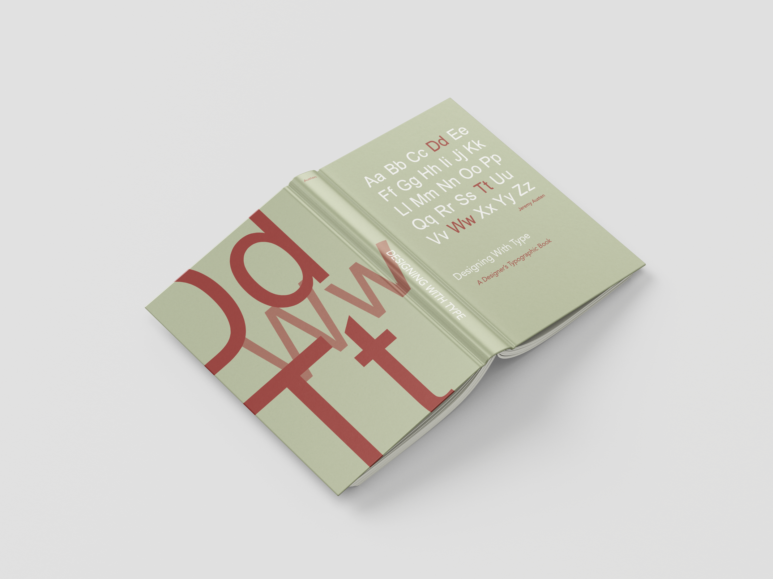
Undertaking the task of designing a book cover and layout (as given in a Typography course) was a journey of knowledge, particularly in understanding typographic design principles. Given the responsibility of ensuring the design reflected the book's content while maintaining readability and visual appeal, I approached the project with a desire to learn and grow.
Through the process, I delved into the intricacies of typography, experimenting with different fonts, sizes, and layouts to find the perfect balance. Each decision was a lesson in itself, teaching me how typography can influence the reader's experience and perception of the content.
As I honed my skills, I found joy in seeing how the design choices I made could enhance the overall presentation of the book. From selecting complementary typefaces to creating a layout that flowed seamlessly, every aspect of the project allowed me to apply and refine my understanding of typographic design.
Ultimately, the project served as a valuable opportunity for me to not only contribute to the creation of a visually appealing book but also to deepen my knowledge of typographic principles. It was a journey of growth and learning that has left me better equipped to tackle future design challenges with confidence and creativity.
The body text is set in Helvetica.
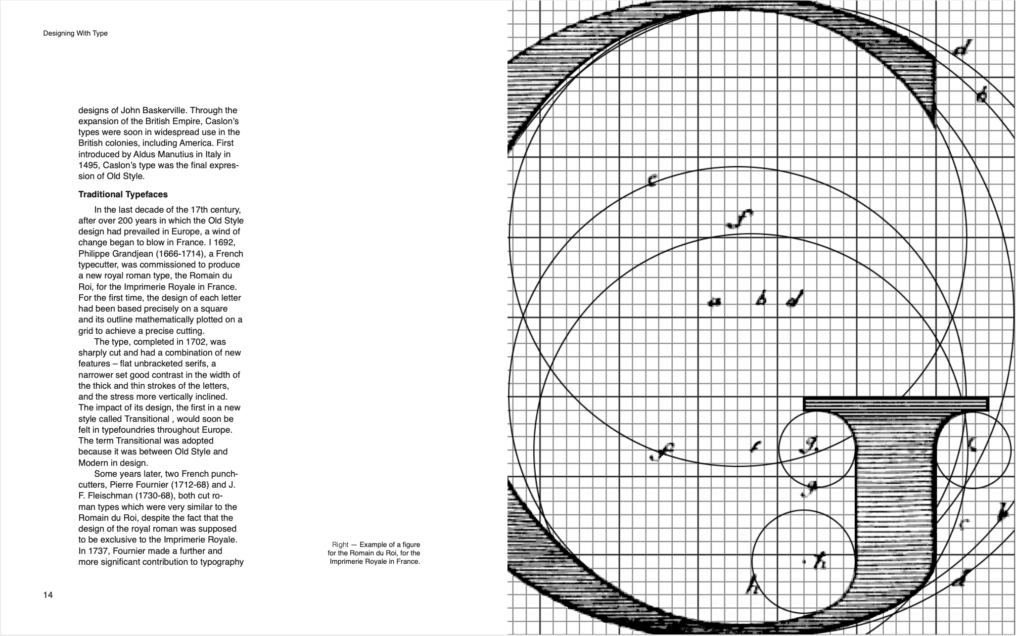
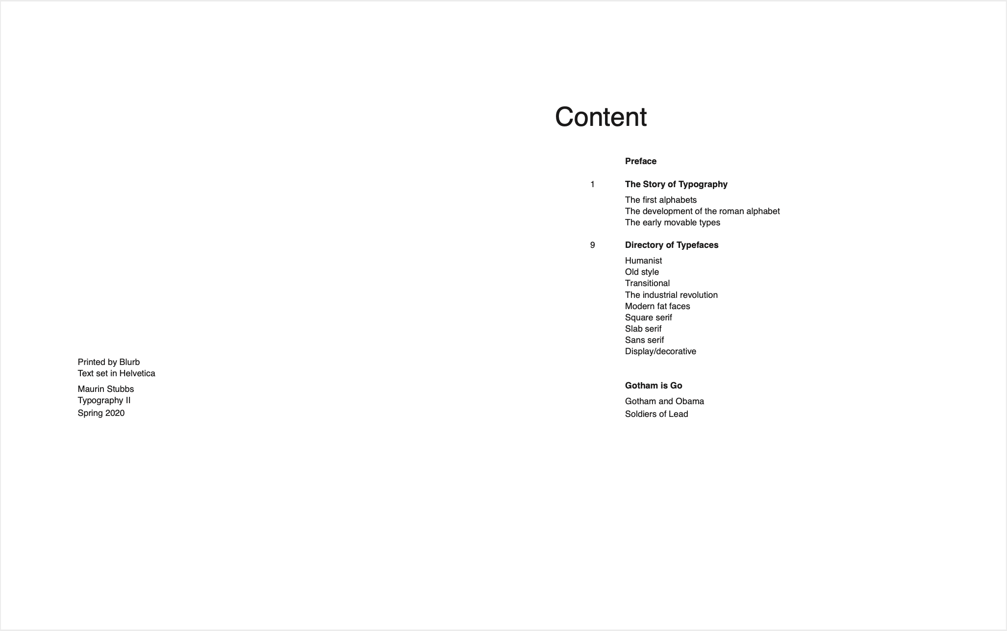
Book printed by Blurb. See a sampling of mockups and digital spreads below.


